In the world of interior design, color is never just a visual element – it is a powerful tool that shapes how we perceive and experience a space. Every shade, hue, and tone we choose plays a role in crafting atmosphere, influencing mood, and guiding the overall design narrative of our home or professional environment.
Color harmony is essential. It ensures cohesion across all interior elements – furniture, wall treatments, cabinetry, flooring, lighting, and décor. Without a thoughtful approach to color combinations, even the most luxurious materials or refined furnishings can appear disjointed or visually overwhelming.
The 5 Essential Rules for Combining Colors of Furniture and Decor Successfully
| Rule | Description | Practical Application |
|---|---|---|
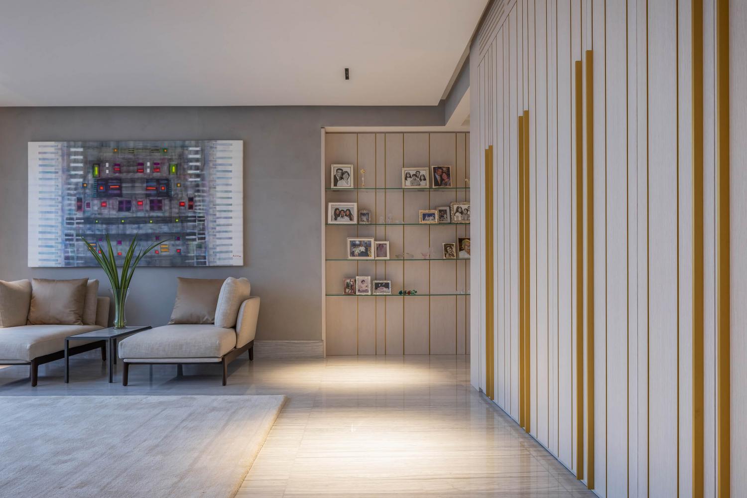
| Start With a Neutral Base | Use white, gray, and beige as timeless canvases that adapt to evolving trends and highlight other design elements. | Combine gray walls with walnut furniture or white walls with colorful art. Use beige to add warmth alongside wood and stone. |
| Look to Nature for Inspiration | Mimic the harmonious palettes of forests, oceans, and landscapes to achieve balance and serenity indoors. | Use sandy tones, seafoam green, or terracotta depending on climate and surrounding environment. |
| Apply the 60-30-10 Rule | Distribute color to create hierarchy: 60% dominant, 30% secondary, 10% accent. | Beige walls (60%), olive green chairs (30%), bronze decor (10%). |
| Experiment With Digital Tools | Use online platforms to preview how different colors work together before committing to changes. | Try apps like Adobe Color or Sherwin-Williams ColorSnap to visualize palettes with furniture and lighting. |
| Use Textures and Materials to Deepen the Palette | Mix matte and glossy finishes, metals, and stones to create depth and nuance within a single palette. | Pair matte beige walls with glossy beige cabinets or mix marble, brass, and linen in the same tone range. |
1. Start With a Neutral Base
Establishing a neutral foundation is one of the most reliable strategies in interior design. Colors like white, gray, and beige act as versatile canvases that allow other hues, materials, and textures to stand out. These tones provide a sense of timeless elegance and can adapt to evolving trends without requiring a complete redesign.
White enhances brightness and creates an open, airy feel, making it a perfect backdrop for smaller spaces or rooms with limited natural light. Gray, in its many shades – from soft dove to deep charcoal – adds a layer of sophistication and is often used to modernize classic interiors. Beige introduces a subtle warmth that evokes comfort and stability. It is especially effective when used alongside natural materials such as wood, leather, or stone.
2. Look to Nature for Inspiration
Nature is the most authentic designer. Mountains, forests, oceans, and flowers all display color palettes that are naturally harmonious and visually soothing. By mimicking these organic combinations, you can bring a sense of balance and serenity into your interior spaces.
Consider the earthy palette of a forest: deep greens, warm browns, soft beige, and muted yellows. These tones can be used to create a grounded, cozy environment in a living room or study. A coastal palette, consisting of sandy neutrals, sky blues, and seafoam greens, brings freshness and calm – ideal for bedrooms and bathrooms.
This approach also allows for regional and seasonal customization. In warmer climates like Miami or Southern California, colors inspired by sunlight, citrus, and turquoise waters feel authentic. In contrast, spaces in urban or mountainous settings may benefit from richer, more grounded palettes – think terracotta, stone gray, and pine green.
3. Apply the 60-30-10 Rule
To maintain balance and focus in a room, the 60-30-10 rule is a trusted formula among designers. It assigns percentages to color usage to ensure that no tone dominates or gets lost.
60% – This is your dominant color, usually represented in large areas such as walls, floors, and large furniture pieces. It sets the tone for the room.
30% – This is your secondary color, used in elements like curtains, accent chairs, or cabinetry. It supports the main color and brings visual diversity.
10% – This is your accent color, which adds contrast and interest. You can use it in artwork, vases, cushions, or trims.
For example, imagine a room with soft beige walls and floors (60%), complemented by deep olive green cabinets or upholstered chairs (30%), and finished with bronze metal decor or mustard-colored pillows (10%). This structure ensures a clear visual hierarchy that feels intentional and organized.

4. Experiment With Digital Tools
Before making permanent decisions with paint or furnishings, using digital color tools can save time, money, and frustration. Online platforms and mobile apps now allow designers and homeowners to preview how colors will interact in a specific space.
5. Use Textures and Materials to Deepen the Palette
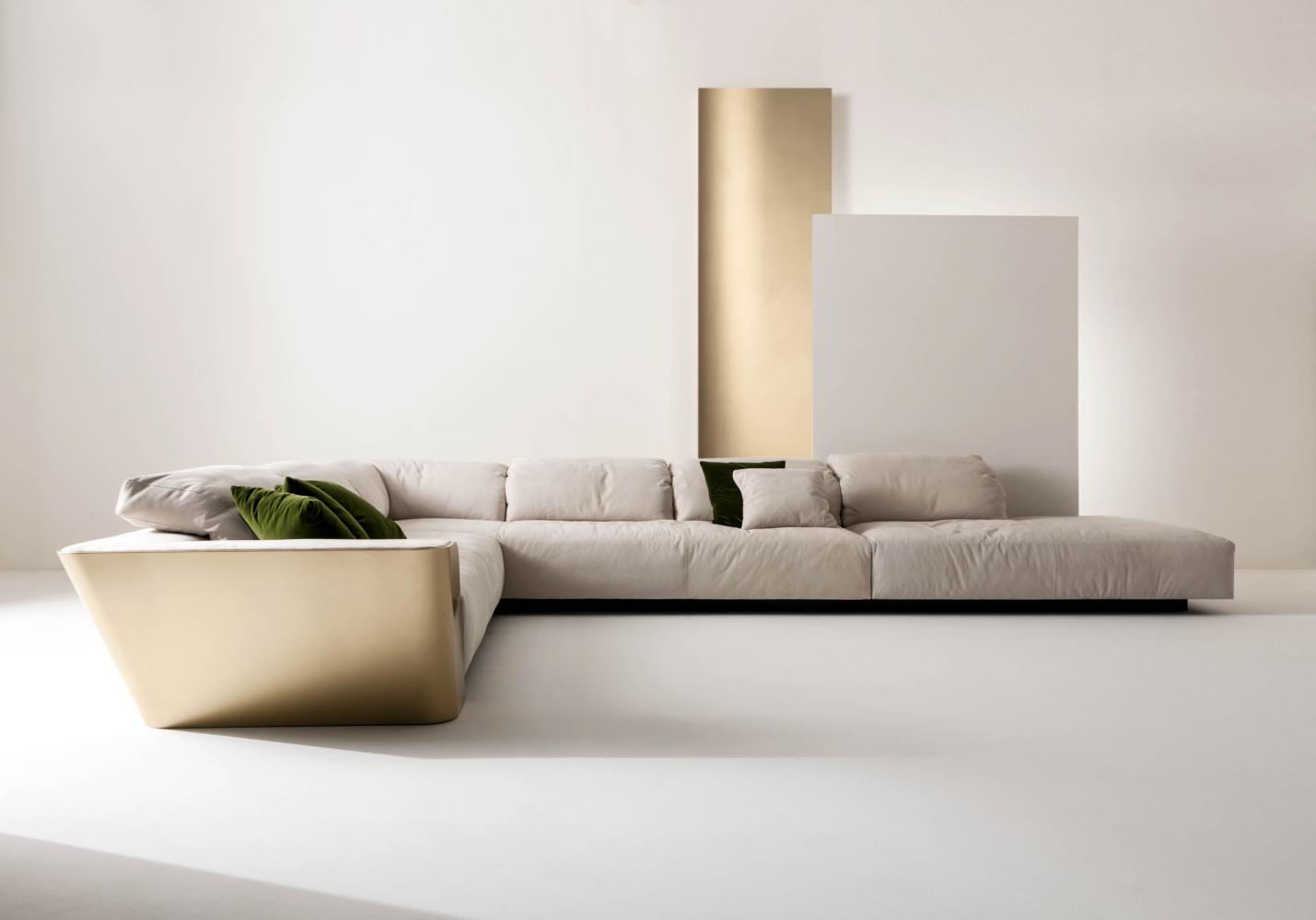
Color alone does not define a space. The material and texture of each design element influence how color is perceived and how a room feels. Matte and glossy surfaces reflect light differently, creating variation in tone even within the same color family. The interplay between smooth marble, rustic wood, brushed metal, and soft fabric adds depth and richness that pure color cannot achieve on its own.
For example, a beige wall in a matte paint finish provides a soft, understated backdrop, while a beige lacquered cabinet front from Materia Collection may appear more vibrant and luminous due to its reflectivity. Combining these two elements in the same space introduces subtle complexity while remaining within a unified palette.
Likewise, metallic accents – whether in bronze, brass, or chrome – can act as transitional tones between warm and cool palettes. Stone surfaces, with their natural veining and variation, break visual monotony and elevate the sensory experience of a space.
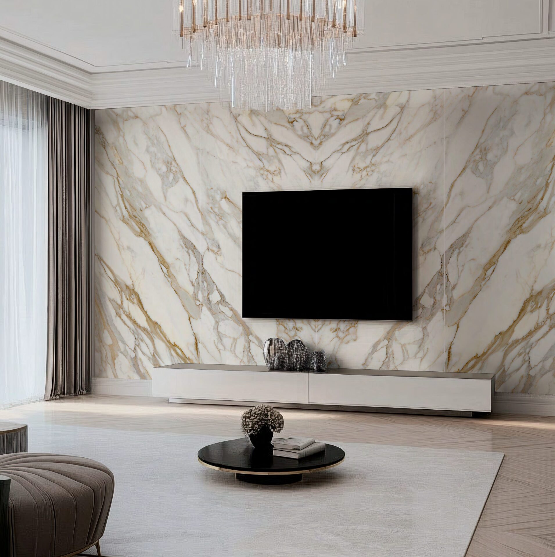
Working with Neutral Tones: Timeless Elegance
Neutral tones are a cornerstone of refined interior design, offering an enduring aesthetic that never goes out of style. Colors such as white, taupe, greige (a blend of gray and beige), and soft stone shades bring serenity, lightness, and a sense of natural calm to any environment. More than just background hues, these colors are powerful tools for creating layered, sophisticated interiors.
Creating Serene Spaces with Whites, Taupes, and Greiges
Whites and off-whites are often used to maximize light and give rooms an airy, open feeling. In combination with architectural lines and clean finishes, white can evoke purity and simplicity, lending itself beautifully to minimalist or Mediterranean-inspired spaces.
Taupes and greiges introduce subtle warmth and complexity, blending the crispness of gray with the earthiness of beige. These tones are excellent for main walls, upholstered furniture, or large-format cabinetry. They provide enough visual structure to ground a room while remaining soft enough to allow for layering and textural richness.
Pairing Neutrals with Pastels for a Romantic Look
Pairing neutrals with pastel tones such as blush pink, soft lavender, powder blue, or mint green introduces subtle color without disrupting the calming energy of a space. This combination works especially well in bedrooms, reading areas, or boutique hospitality settings where the goal is intimacy and refinement.
A greige wall panel paired with a blush-toned velvet armchair, for instance, creates a feminine and understated luxury. Add golden lighting accents or matte brass hardware to the composition, and you achieve an interior that feels both romantic and modern.
Pairing Neutrals with Saturated Colors for Bold Contrast
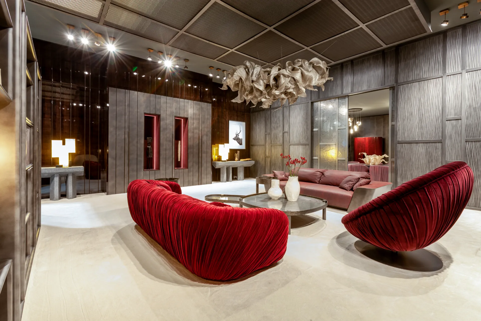
Neutral tones also provide the perfect backdrop for introducing saturated hues, creating dramatic contrast and dynamic tension. A beige or stone-gray wall allows deep jewel tones – like emerald, sapphire, or burgundy – to pop without clashing or overwhelming the space.
This technique is particularly effective when used selectively. A richly upholstered Materia armchair in deep blue velvet placed against a neutral paneling system will command attention while maintaining the overall balance of the room. Likewise, a dark green built-in shelving system can create visual depth against soft gray walls and flooring.
How Materia’s Custom Finishes and Textures Elevate Neutral Palettes
Materia Collection specializes in transforming neutral tones into luxury statements through the use of custom textures, rare materials, and meticulous finishes. A beige is never just beige – depending on the finish, it may take on a pearlescent shimmer, a concrete-like matte texture, or a woodgrain pattern that mimics natural oak or ash.
This is particularly important in high-end design, where subtle differences in tone, grain, and sheen define the final result. A white high-gloss lacquered surface reflects light and adds contemporary brilliance, while a brushed limestone panel provides softness and organic tactility.
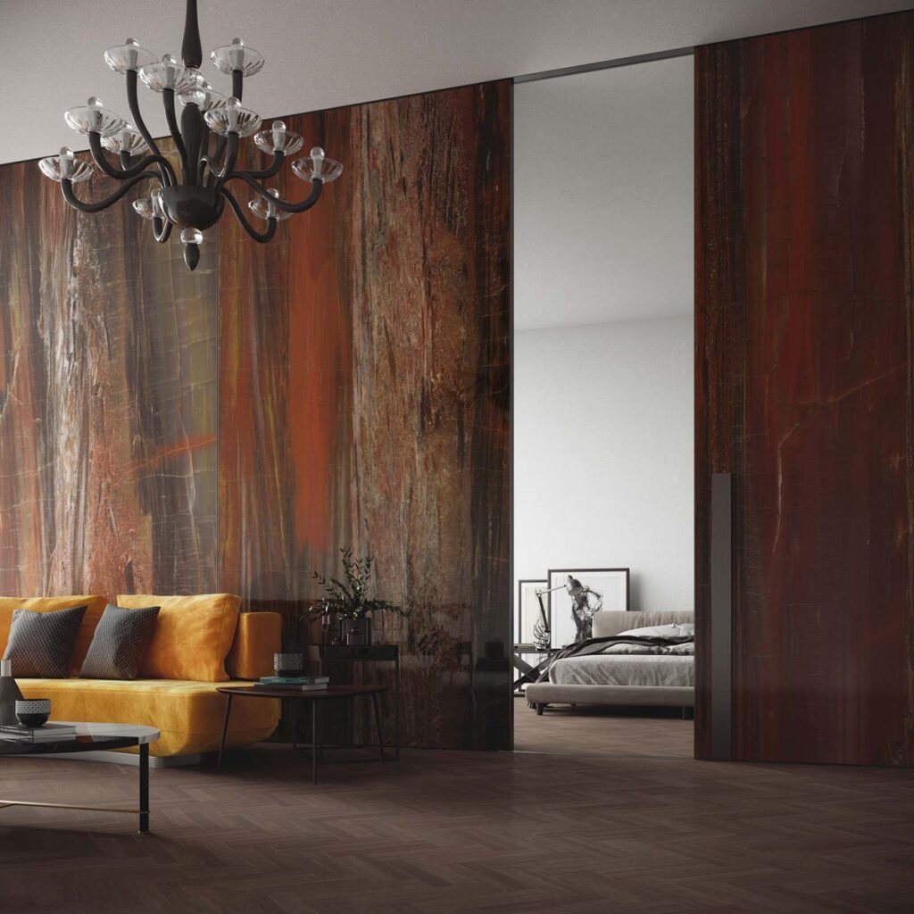
Warm Colors and Bold Accents for Energy and Depth
While cool tones dominate calm and reflective interiors, warm colors-including red, orange, yellow, and gold – are essential for injecting energy, optimism, and richness into a space. Used thoughtfully, they can create impactful focal points and enliven more neutral or monochromatic environments.
Using Red, Orange, Yellow, and Gold in Moderation
These colors are inherently stimulating. Red increases energy and appetite, orange evokes sociability and enthusiasm, yellow is associated with joy and brightness, while gold signifies opulence and prestige. However, due to their intensity, they must be used with restraint to avoid overpowering the space.
Rather than covering entire walls or using them as the primary tone, these shades are most effective in accents – select furniture pieces, trim details, textiles, or art. A bright saffron armchair in an otherwise neutral room can create a powerful yet elegant statement.

When to Apply Bold Accents: Chairs, Lighting, Wall Panels
Accent chairs are one of the most successful ways to introduce warm colors. A Materia-designed chair in mustard yellow or burnt orange, for example, can serve as both functional seating and sculptural art.
Lighting fixtures in brass or matte gold bring in warmth through both material and reflected light, adding depth and contrast to cool or neutral palettes.
Decorative wall panels in deep rust or red tones can ground a feature wall or entryway, especially when balanced with softer surrounding elements.
Each of these applications allows for experimentation and personality without sacrificing overall elegance.
Materia’s Luxury Statement Pieces That Complement Warm Palettes
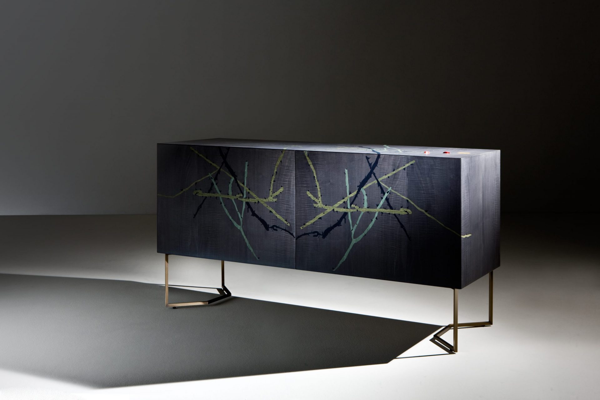
Materia’s catalog includes custom furnishings and surfaces that are designed to accommodate and enhance bold accent colors. High-end sideboards in rich wood tones, wall units with golden inlays, and Italian-made lighting in brushed brass are just a few examples of how the brand balances warmth with craftsmanship.
Incorporating these elements into an interior plan allows warm colors to emerge through form, material, and structure – not just paint or fabric. The result is a room that feels alive with energy yet restrained by elegance, a signature of Materia’s design ethos.
Choosing Furniture Finishes to Match Color Palettes
How Furniture Texture and Material Affect Color Perception
Color does not exist in a vacuum. It changes based on lighting, reflection, and surface texture. A gray velvet sofa will appear entirely different from a gray polished concrete wall, even if the tone is identical. Velvet absorbs light and appears softer, while concrete reflects it unevenly, appearing cooler and harsher.
Pairing Woodgrain Sideboards with Cool or Warm Tones
Wood is one of the most flexible materials when it comes to color compatibility. Lighter woods like ash and maple pair beautifully with cool tones like seafoam green, icy gray, or pale blue. These combinations are ideal for Scandinavian-inspired or coastal interiors.
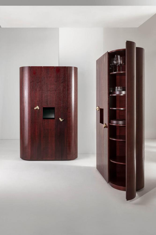
Darker woods such as walnut or mahogany complement warm palettes – rust, mustard, olive green – by providing depth and visual weight. In transitional or classical interiors, this contrast is not only welcome but essential.
Materia’s collection of custom woodgrain sideboards, consoles, and wall units are made to integrate seamlessly into both cool and warm schemes, with handcrafted finishes that highlight the grain, not obscure it.
Reflective Finishes (Lacquer, Metallics) vs. Matte in Tonal Balance
High-gloss lacquer, metallic sheens, and mirrored surfaces reflect light, making colors appear bolder and more saturated. These finishes are ideal for smaller spaces where light needs to bounce, or for statement pieces that serve as focal points.
Matte finishes, on the other hand, absorb light, softening color and reducing glare. They are perfect for grounding a room, creating intimacy, or emphasizing architectural form.
Materia’s Artisan Surfaces and Italian Craftsmanship as a Tool for Balance
Materia’s commitment to Italian craftsmanship ensures that every surface, tone, and material is perfectly tuned for balance and harmony. Surfaces are never just treated – they are curated. Whether it’s a brass-inlaid desk, a stone-clad wardrobe, or a hand-finished wood panel, Materia elevates each element to work in unison with its color palette.
Mistakes to Avoid When Combining Colors in Interior Design
Even with a well-developed color palette, design missteps can easily disrupt the harmony of a room.
Overusing Bright Accents
Bright colors – such as red, fuchsia, or lemon yellow – should be used sparingly. While they add energy, overusing them can create visual chaos and disrupt the calm of a well-composed space. In luxury design, bright accents should highlight specific elements, such as a single chair, a vase, or a section of art.
Ignoring the Light Source and Natural Lighting
Color changes dramatically depending on the direction and quality of natural light. South-facing rooms tend to amplify warm tones, while north-facing spaces can dull cooler ones. Failing to test colors under changing light conditions can lead to results that feel off-balance or unintentionally cold.
Using Too Many Tones Without Hierarchy
While diversity in color can be engaging, using too many tones without a clear hierarchy dilutes focus and disrupts spatial flow. The eye requires guidance, and each room benefits from a dominant, secondary, and accent color.
This is why the 60-30-10 rule is so effective – it gives structure to your color usage. Without this kind of hierarchy, even the most luxurious furnishings can appear haphazard.
Not Considering the Texture and Scale of Furniture in Color Planning
Color is never perceived in isolation. Texture and scale affect how we perceive tone and contrast. A large matte gray wardrobe will dominate a space differently than a small gray ceramic vase, even if the color is identical.
Likewise, mixing too many textures – high gloss, brushed metal, rough stone – without balance can lead to a space that feels noisy rather than layered.
Mastering the art of combining colors in furniture and décor is not merely a matter of taste – it is a discipline rooted in understanding psychology, space, light, and materials. From foundational principles like selecting a neutral base to more advanced techniques like coordinating feature walls with custom furniture, every decision shapes how a room feels and functions.
Through custom finishes, natural materials, and artisan surface treatments, you are not limited to what’s trending. You are free to experiment boldly and refine elegantly, building a space that evolves with you and reflects who you truly are.
Discover the Art of Italian Design with Materia Collection
At the heart of Materia Collection is the vision of Yana Pojidaeva, a woman entrepreneur who turned her deep passion for Italian design into a brand of international repute. With over 15 years of experience in the design industry, she founded Materia in 2016 to offer clients a level of sophistication and customization rarely found in today’s global furniture market.
From its flagship showroom in Bay Harbor Islands, Florida, to the recently opened New York City location on 5th Avenue, Materia has redefined what it means to furnish a space. The brand’s reach spans across private residences, penthouses, and luxury apartments, as well as refined commercial environments such as boutiques, restaurants, and corporate offices.
Explore. Customize. Refine.
Experience the true essence of Italian design with Materia.